QuickReviewer’s New Commenting Experience: Smarter Online Proofing for Modern Review & Approval
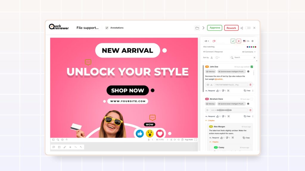
Online proofing software is essential for marketing, design, product, and content teams, replacing long email threads and scattered files with streamlined feedback and approvals. QuickReviewer, an online proofing tool, supports various assets like videos, PDFs, and websites in a single platform. Its latest update enhances the commenting experience, improving clarity and control for handling complex feedback and multiple stakeholders.
This blog highlights the new features and their benefits for your review and approval workflow.
Why comments are the real engine of online proofing
Online proofing is more than just uploading files to a cloud workspace. The real value
lies in how teams discuss those files: adding comments, replying in threads, annotating
accurately, resolving items, and tracking decisions.
When the commenting experience is weak, teams feel it in several ways:
- Important feedback gets buried or skimmed.
- Long discussions become confusing or impossible to follow.
- Stakeholders are unsure who did what, or who is responsible for the next step.
- Reviewers are forced back into email or chat for “clarifications”.
Modern creative approval software aims to solve exactly these problems by offering structured, centralized comments, version control, and clear accountability. QuickReviewer’s latest release goes deep into these areas with thoughtful UI and UX upgrades designed for real-world review scenarios.
Upgrades that apply across all proofs
These changes impact all proof types in QuickReviewer—PDF proofing, video proofing, image review, audio, HTML, and website proofing—so reviewers get a consistent experience no matter what they are working on.
1. Thumbs-down button: rapid “this needs work” signals
Not every reaction needs a paragraph of text. Sometimes the only clear message is: “This isn’t right yet.”
QuickReviewer now introduces a thumbs-down button on comments and conversations, enabling reviewers to reduce comment clutter caused by short, repetitive “No” or “Please change” messages.
In a busy review and approval workflow, this lightweight, negative reaction helps teams prioritize what truly needs attention, without overloading threads with redundant text.
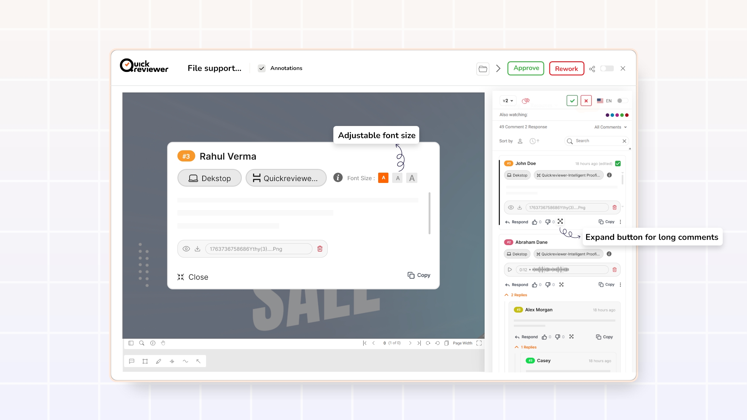
2. Expand button for long comments + adjustable font size
Long comments often contain the most important information: multi-step requests, nuanced brand guidance, compliance notes, or cross-functional input. But when those comments are squeezed into a small panel, reviewers naturally skim or miss details.
To address this, QuickReviewer has added:
- An expand button on lengthy comments
- A pop-up preview that shows the full comment clearly
- An option to increase the font size for better readability
This design supports:
- Detailed creative feedback (e.g., multi-point layout adjustments or copy rewrites)
- Long-form context from stakeholders—such as legal or product—who need space to explain decisions
- More comfortable reading for users on smaller screens or long review sessions
Clear, readable feedback is a cornerstone of effective online proofing platforms and reduces the risk of misinterpretation or rework.
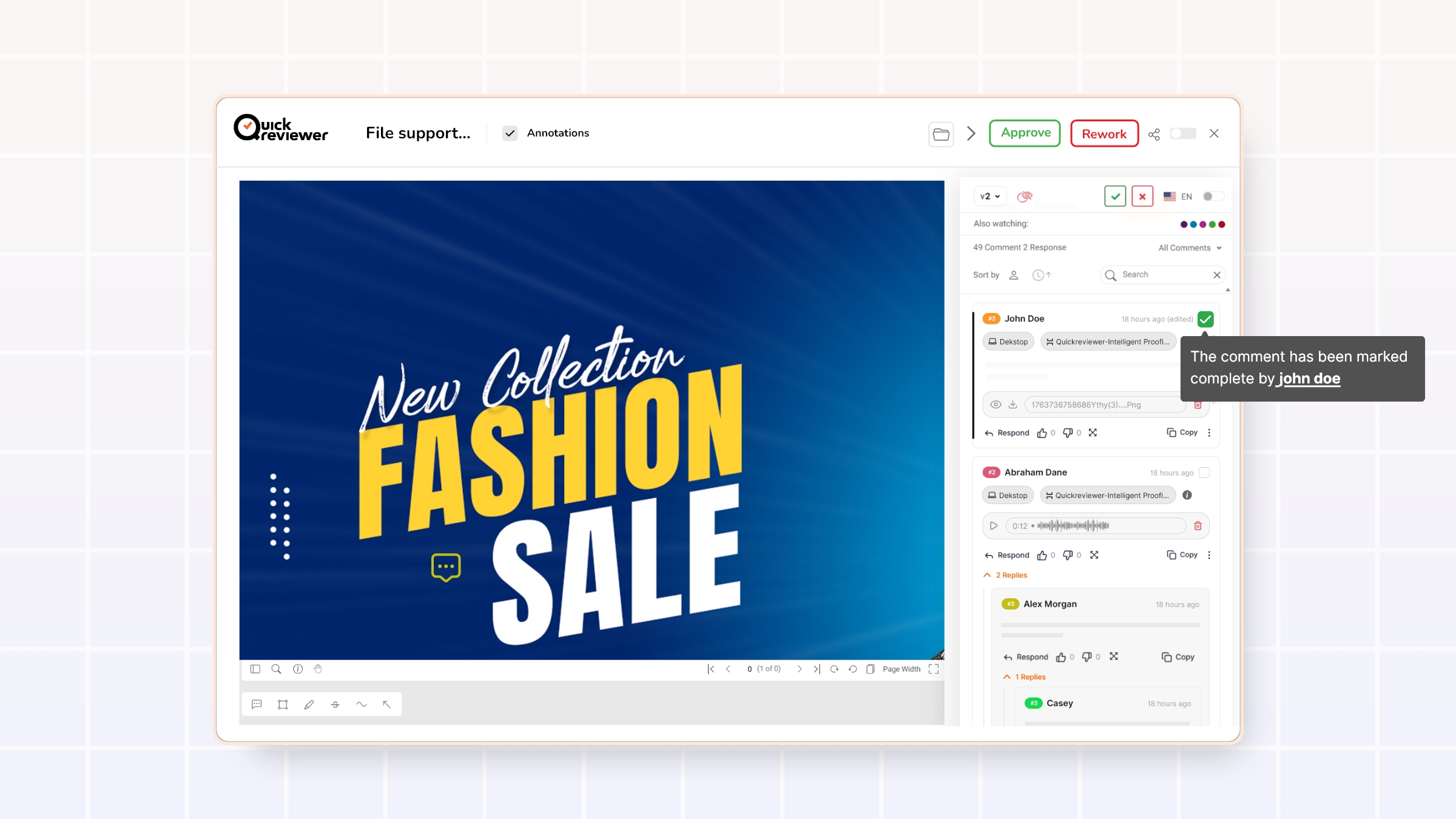
3. Hover to see who completed a task
Accountability is central to any review and approval workflow. Teams need to know who completed what, especially in collaborative workspaces with many contributors.
Now, when hovering over a completed task, QuickReviewer shows who completed it. This is particularly helpful when:
- Multiple teams or departments are working on the same proof.
- Project leads need to follow up on specific actions or clarifications.
- Stakeholders want a quick audit of who signed off on what.
Clear ownership makes it easier to track responsibility and avoid confusion later in the project lifecycle.
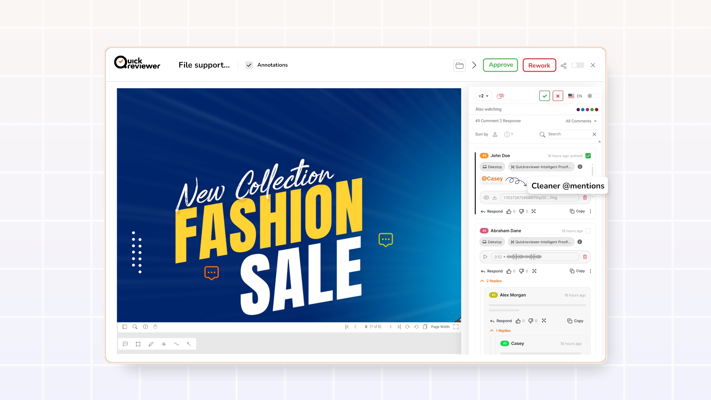
4. Cleaner @mentions without parentheses
Mentions are one of the most powerful tools in any collaboration environment. They direct attention, assign tasks, and make it obvious who needs to respond.
QuickReviewer has refined the appearance of @mentions so that:
- Tagged names appear with a clean “@” prefix and highlighted colors.
- Extra parentheses around names are removed, resulting in a simpler, more modern design.
The outcome:
- Mentions stand out visually within comments.
- Reviewers can quickly scan threads to find where they have been tagged.
- Conversations feel more familiar to users used to modern collaboration tools.
This improves both usability and adoption, which are critical to the success of any online proofing platform.
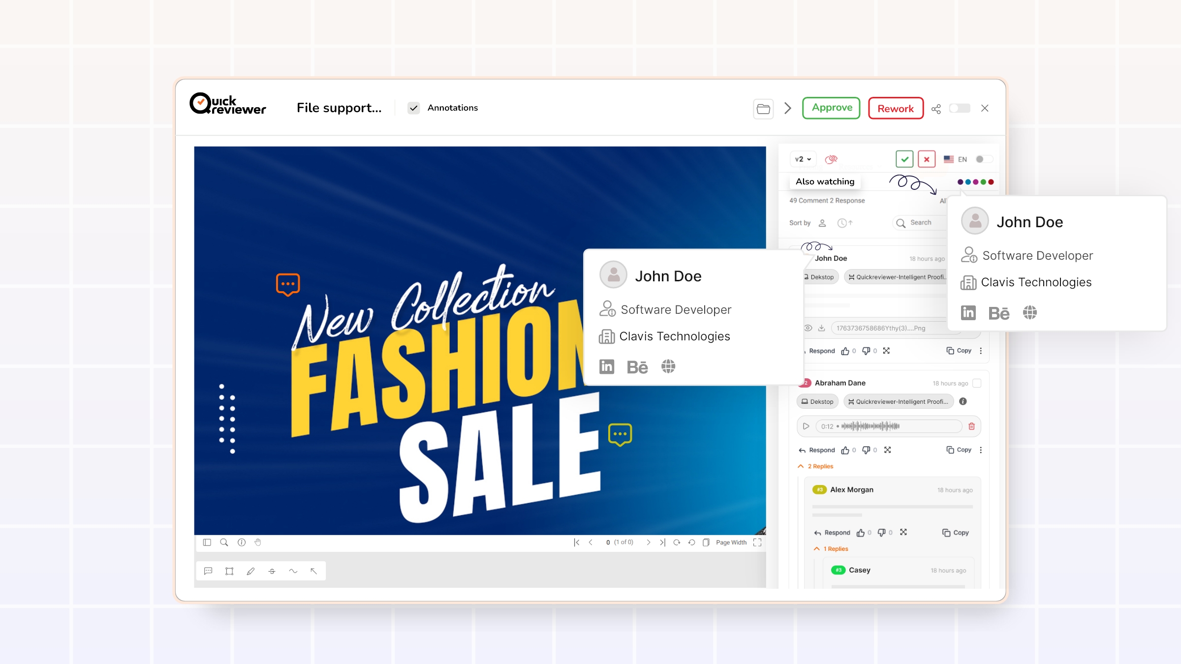
5. Rich profile hovers for “Also watching” and commenter names
Good collaboration is not just about what is said, but who is saying it.
QuickReviewer now enhances this by allowing users to:
-
- Hover over colored bubbles in “Also watching” or
- Hover over commenters’ names
to see a profile pop-up with more details about each participant.
This gives teams:
- Instant context about each reviewer’s role (e.g., brand, design, legal, product).
- Better interpretation of feedback (“This concern is from compliance” vs “This is from a designer”).
- A nudge to keep profiles complete and accurate, since missing details are handled via the profile section.
In a typical review and approval process, understanding stakeholder roles directly influences how feedback is prioritized and implemented.
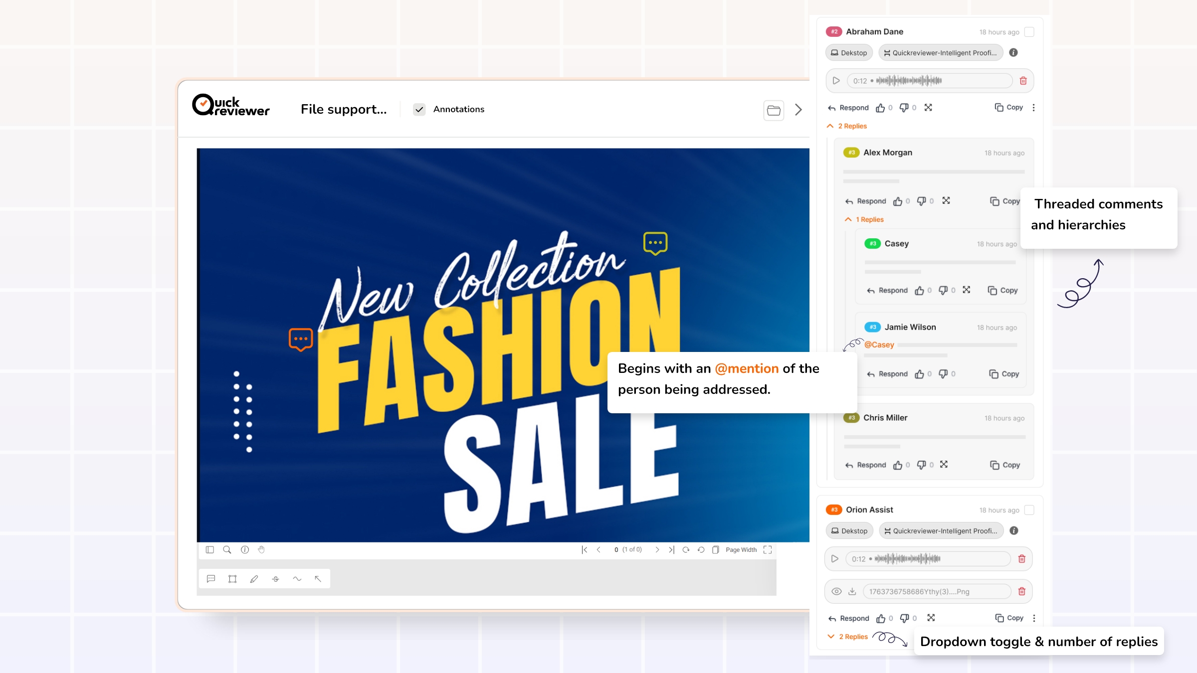
6. Deeper threaded conversations with smarter reply behavior
Flat comment streams quickly become confusing once multiple people start replying to the same point. Well-designed online proofing tools use threaded comments and hierarchies to keep conversations intelligible.
QuickReviewer’s new design introduces more structure:
Second-level replies with counts and toggles
Each top-level comment now:
- Displays the number of replies it has.
- Offers a dropdown toggle to open or close all replies.
This makes it easy to:
- Skim just the top-level feedback when in a hurry.
- Expand only the threads that matter to a given role.
- Identify “hot spots” where many replies indicate ongoing discussion or unresolved decisions.
Third-level replies anchored with @mentions
From the third reply level onward, each reply:
- Follows the visual style of second-level replies (no excessive indentation).
- Begins with an @mention of the person being addressed.
This approach keeps deep discussions readable on all screen sizes without constant indentation, while still making it obvious who each message is directed to. It balances clarity with layout stability—a frequent challenge in conversation design.
Together, these reply upgrades make complex creative discussions manageable rather than overwhelming.
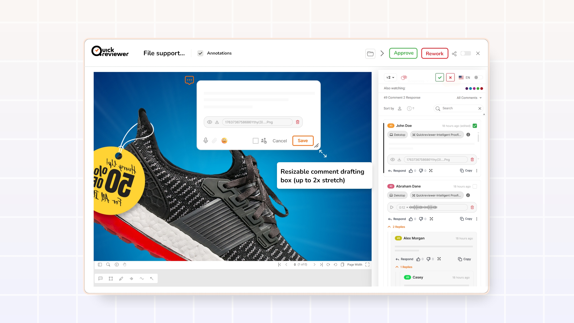
7. Resizable comment drafting box (up to 2x stretch)
Providing thoughtful feedback often requires more than a short sentence. Reviewers might need to:
- Provide detailed reasoning for a requested change.
- Suggest multiple alternative options.
- Paste updated or alternative copy directly into the comment.
QuickReviewer now allows the comment drafting box to be stretched up to 2x in both length and width. This flexibility:
- Makes it easier to compose and review longer comments.
- Reduces errors caused by editing in a cramped space.
- Encourages reviewers to structure feedback more clearly.
Long-form content—whether in a blog or a comment—performs better when writers can see enough of their text at once to refine structure and clarity.
Web proofing enhancements: more clarity for multi-page websites
Beyond generic commenting improvements, this release introduces powerful enhancements for website and HTML proofing, specifically. Online proofing platforms increasingly need to handle complex websites, landing pages, and responsive layouts, not just static files.
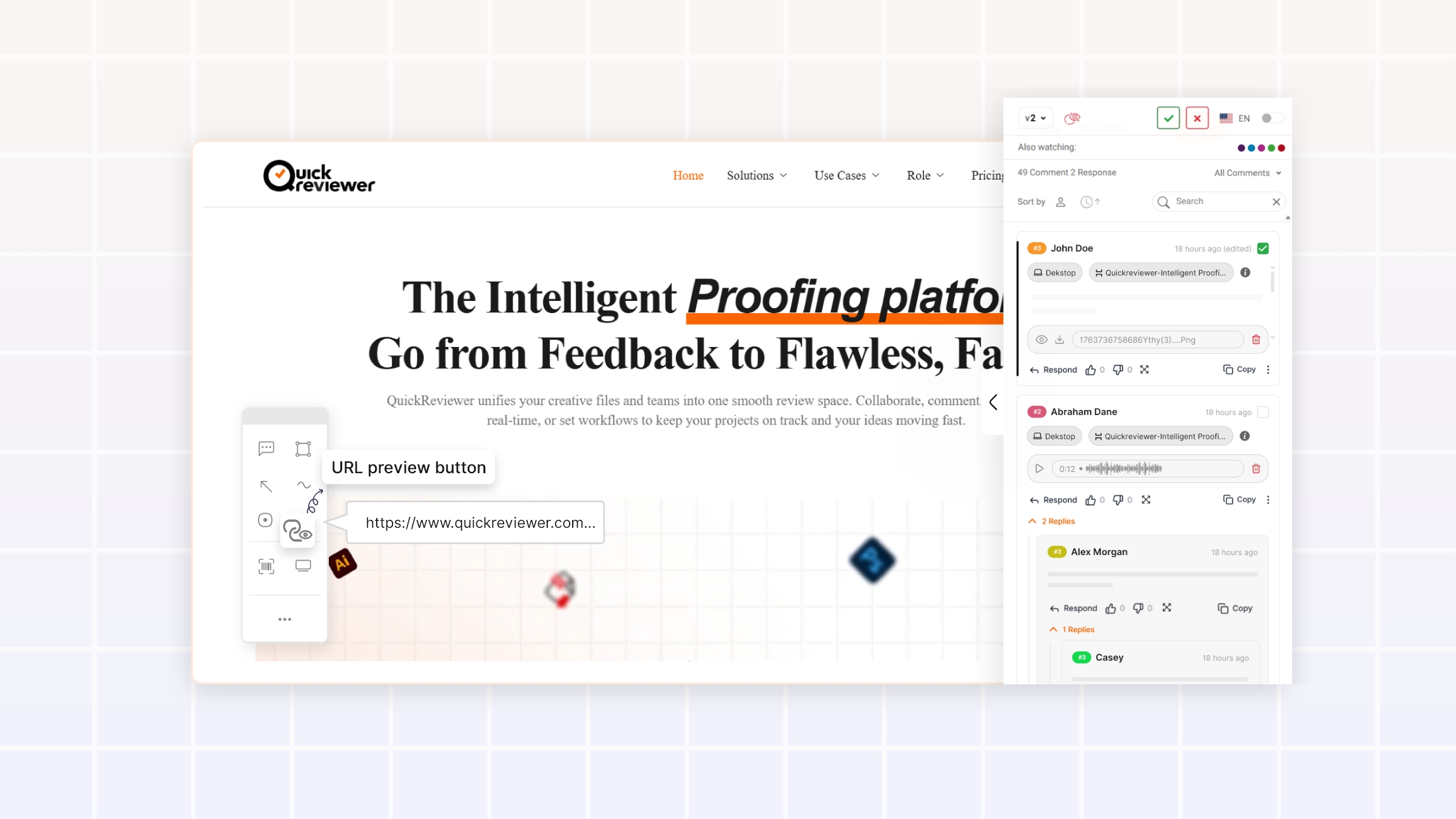
1. URL preview button for multi-page sites
In multi-page website reviews, one recurring issue is simply: “Which page am I on right now?”
QuickReviewer now includes a URL preview button that lets reviewers:
- Instantly identify the current URL or route being viewed.
- Avoid confusion between similar pages or variants.
- Leave more precise, actionable comments (e.g., referencing the exact URL in their notes).
For development and product teams, this precision significantly reduces ambiguity and accelerates implementation.
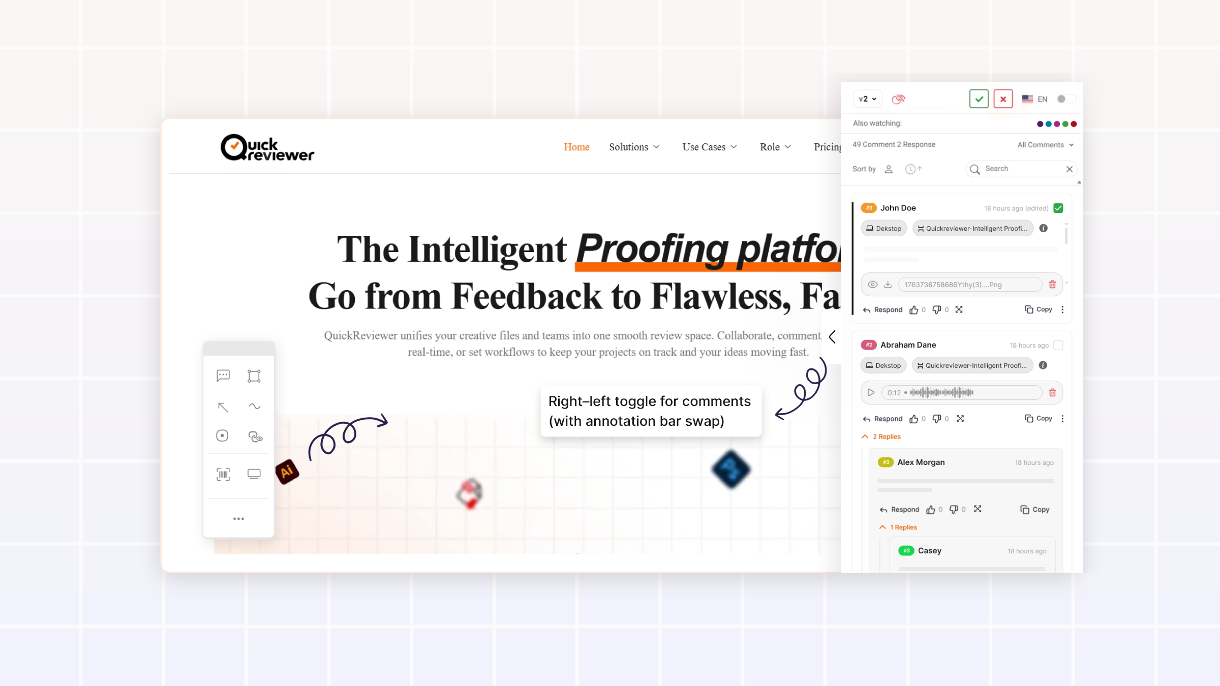
2. Right–left toggle for comments (with annotation bar swap)
Every website layout is different. Some designs have heavy right rails, others have fixed left navigation, and still others are more symmetric. A one-size-fits-all comment panel position can easily get in the way of critical content.
QuickReviewer now lets users:
- Toggle the comment section between the right and left sides of the screen.
- Automatically swap the annotation bar to the opposite side when the comment pane moves.
This flexibility:
- Makes it easier to annotate content that might otherwise be covered by the comments.
- Supports personal preferences for reading and interacting with comments.
- Improves usability across various screen sizes and layouts.
Combined with device previews and responsive testing, this supports a complete website proofing workflow in one place.
How these improvements strengthen your review and approval workflow
Taken together, these enhancements are not just cosmetic changes. They directly impact the speed, clarity, and reliability of your review and approval process.
1. Fewer miscommunications, fewer rework loops
- Expandable comments and side-scroll indicators reduce the chance that reviewers miss critical lines.
- Threaded replies with clear counts and @mentions keep conversations coherent, even across long discussions.
- Smart truncation and hover details prevent visual breakage while preserving access to complete information.
The result is less back-and-forth to “clarify what was already said” and fewer unnecessary revision rounds.
2. Faster onboarding for stakeholders and clients
- Clean @mentions and intuitive interaction patterns make the interface feel familiar.
- Profile hovers provide instant context about each reviewer’s role.
- The comment box resize and cancel button make the tool feel forgiving and comfortable.
New stakeholders can join a proof and understand how to interact with it quickly, without extensive training or documentation—an important factor in user adoption of any SaaS platform.
3. Stronger accountability and traceability
- Hover-to-see who completed a task clarifies responsibility.
- URL preview for web proofs ties feedback directly to specific views or pages.
- Structured comment threads provide a clear history of decisions and discussions.
This improves governance and makes it easier to answer questions like “Who approved this change?” or “Which version did this decision apply to?”
Getting the most out of the new QuickReviewer experience
To fully benefit from these enhancements in your online proofing workflow:
-
- Highlight key behaviors to your team
Share a brief internal note or quick walk-through covering:- Thumbs-down reactions
- Long comment expansion and font sizing
- Reply counts and thread toggles
- URL preview for web proofs
- Left/right comment panel toggle
- Highlight key behaviors to your team
- Encourage good comment practices
-
- Use @mentions consistently, especially in deeper replies.
- Keep top-level comments focused; move side discussions into replies.
- Use thumbs-down reactions when something clearly needs rework.
- Improve profile completeness
Ask reviewers to keep their profile names and designations up to date so profile hovers offer meaningful context. - Experiment with layout per proof
For website proofing, try both comment panel positions to see what works best for each design.
Why now is a good time to upgrade your review process
The market for online proofing tools and creative approval software continues to expand as more teams move their content production and collaboration online. Many platforms can host files and capture comments. Fewer are investing deeply in how those comments behave when the conversations become complex, multi-layered, and mission-critical.
QuickReviewer’s new commenting experience focuses exactly on that challenge:
- Supporting long, detailed feedback without sacrificing readability
- Making deep threaded discussions manageable
- Enhancing profile and task context for better accountability
- Giving web proofing the URL-level clarity it deserves
Teams that embrace these improvements stand to gain a faster, calmer, and more predictable review and approval workflow. Teams that continue relying on fragmented email chains, chat logs, and manual tracking risk slower turnarounds, more miscommunications, and a less professional experience for stakeholders.
For any organization serious about scaling creative production, content marketing, or product UX reviews, this release is a strong reason to take a fresh look at what a modern online proofing platform like QuickReviewer can do.